Las 40 mejores carátulas de la historia de los videojuegos [Según PSD]
la mejor caratula de todas ami criterio es la de god of war 2
- Unido
- junio 18, 2008
- Mensajes
- 6,206
- Karma
- 6,036
Os las pongo todas directas 
La mejor caratula de la historia es esta:

A mi gusto la mejor es esta.
This post was compiled with help from Danny Outlaw.
40. Diablo II
While many games use a Hellish black and red color scheme in their cover art, no game has ever done this quite so well as Diablo II. The embossing used to accentuate the logo and the outlines around Mephisto's facial (skull-ial?) features are a nice tactile addition, while the wizard style hood Mephisto is wearing and strange runes remind players that this is a dark fantasy game, not just pure horror.

39. Crysis
The washed-out blue/gray of color scheme draws attention to the points of red light on the power suit, as well as to the EA logo, which is cleverly modified for the cover. While the power-suit is distinctly sci-fi, the tropical mountain and palm-trees hint that the setting may not be quite what you expect! The colors are also extremely cold, consistent with the freezing temperatures that you encounter periodically throughout the game. This creates an interesting contrast with the tropical setting subtly depicted on the cover.

38. Resistance: Fall of Man
This game's cover art uses the classic image of a helmeted skull in a battlefield with a new and striking twist. As you can see, the skull is thoroughly mutated, suggesting that the world is no-longer as we know it. The intricate detail in the logo design is also worth mentioning.

37. Killzone 2
While the 'helmeted figure glaring out at viewer' is a game art cover standard, Killzone 2 does this really well. The burning points of light in the character's eyes are extremely intense and provide a central point of focus. This edges it just ahead of its rival in this cover style, Fallout 3.
Killzone 2

Fallout 3

36. Baldur's Gate II: Shadows of Amn
The Baldur's Gate game covers were all designed to look like mystical, leather-bound books with a central emblem. This demonstrated the game's high fantasy setting while also unifying the cover art across each game and expansion pack.

35. Sim City 2000
An idyllic, colorful city. An absurd space-ship bordered with pink neon. An art deco logo. The cover is that special brand of Maxis-weird that you won't find anywhere else. The signatures of Will Wright and Fred Haslam (the game's designers) are a really nice touch and emphasize the craftsmanship behind the game.

34. F.E.A.R.
This cover art throws a spanner into the workings of the traditional 'shooter' cover. While it features action and armored, armed figures, the whole scene is overseen by the ghostly--and in this rendering, larger than life--Alma. As this image is really the iconic image from the game, the graphic designers have cleverly made this the centerpiece of the cover.

33. Star Wars: The Force Unleashed
The central theme throughout this cover design is the powerful Force-wave being unleashed by the central figure. It shapes the entire composition. The designer's have also cleverly warped the game's logo, as if it too is being affected by this explosion of power. While the game may not be an instant classic, the cover certainly is.

32. Age of Empires II: Age of Kings
This cover packs plenty of detail without cluttering the composition. By rendering the background illustrations in shades of the same color, focus is not drawn away from the three central figures and the game's logo.

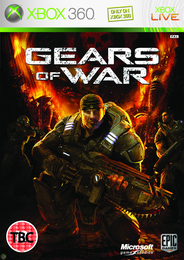
31. Gears of War
While 'armored guy with weapon' is a front-cover cliche, this one stands apart from the pack by virtue of its attention to detail. The characters and even the background setting are meticulously rendered, creating a rich overall image.
30. Jade Empire
The game's regal logo and mythic concept artwork results in a cover that cleverly represents this oriental fantasy game. The cover offers a whirlwind introduction to a genre with few precedents.

29. Sins of a Solar Empire
The cover's brilliant blue at the bottom contrasted with solar red at the top focuses attention on the game's striking logo.

28. Elder Scrolls IV: Oblivion
While the cover art isn't flashy, it's remarkable for its clever use of texture. The design appears to be rendered on an ancient, fraying canvas. The game's cover entices you to touch it.

27. Deus Ex
This cover is note-worthy because of the way it uses color and representative imagery to perfectly capture the mood of the game.

26. Alone in the Dark
While the Alone in the Dark games have been re-invented since the first debuted in 1992, the game's covers have retained a remarkable sense of unity, paying homage to the original classic cover design with a modern horror update.
Alone in the Dark (1992)

Alone in the Dark (2001)

25. Lego Batman
The 'LEGO' games as a franchise have featured covers that blend established pop culture figures (Indiana Jones, Star Wars characters) with Lego imagery, adding a clever new twist to images we're all familiar with.

24. Mass Effect
A classic space opera cover featuring the BioWare designed Commander Shepherd character. Though you could customize your character's face with a variety of facial modeling features, BioWare's default model was so realistic that it quickly became a representative for a new era in human realism in video games.

23. Little Big Planet
This cover fuses gorgeous hand-made elements with controlled explosions of color.

22. Contra
Another retro title, Contra is renowned for being one of the most difficult games in history. Its cover is remarkable for its clarity of message: "This is a game about being a bad-ass and shooting alien scum!"

21. World of WarCraft
The visual style of this virtual world is part of its branding, and this is portrayed faithfully in the cover art. The gold, circular frame around the central image is carried through the cover art for the expansion packs also, creating unity between each World of WarCraft product.

20. System Shock 2
The image of SHODAN, the game's insane AI antagonist, is one that has become an icon in sci-fi/horror video gaming history.

19. Far Cry
The first installment in the Far Cry series was, at the time, a pioneer in the development of realistic natural environments in games. While other shooters focused on dark corridoors and gloomy, linear areas, Far Cry rendered a lush tropical environment. The cover conveys this perfectly and would have stood out brilliantly against the other dark and clichéd shooters on the shelves.

18. The Sims 2
'The Sims' franchise of games are among the best-selling in history. Here, the graphic designs have cleverly incorporated the 'mood diamond' (an essential part of the games' user interface) into its logo. The figures chosen for the cover cleverly represent the key aspects of gameplay in The Sims 2.

17. BioShock
The BioShock logo is certainly one of the coolest in modern gaming, and the cover art ticks all the boxes when it comes to featuring iconic images from the game: the Little Sister, the Big Daddy, and the water that spills out everywhere. BioShock is all about mood, and this cover captures it perfectly.

16. Half Life 2
Every Half-Life fan recognizes the distinctive face of Gordon Freeman, the game's silent hero. Though the game features many stunning visuals that could have been used to represent it on the cover, the designers cleverly simplified down to Half-Life's most distinctive image.

15. StarCraft
Alien eyes stare out at you from the cover of the original StarCraft. The expansion packs unified the visuals by featuring different exotic faces on their respective covers.

14. Pokemon Blue
The Pokemon games for Game Boy were cleverly designed. Call the game a color, feature a Pokemon colored to match the game's title, do the same with the background. It seems simplistic, but for the legions of kids who wanted these games it meant that you could spot who had what Pokemon cartridge from across the playground. The end result were arguably the most memorable Game Boy game covers ever created.

13. Halo
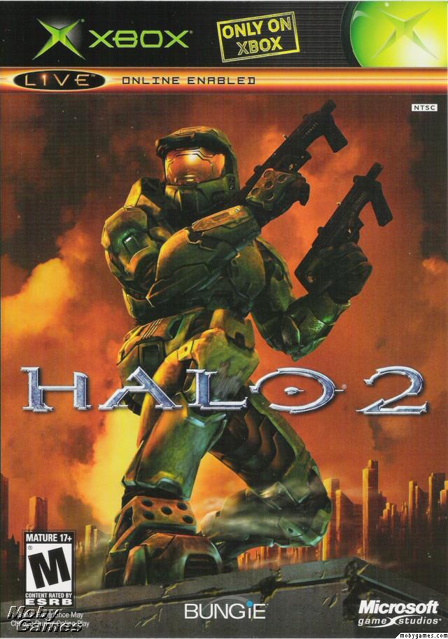
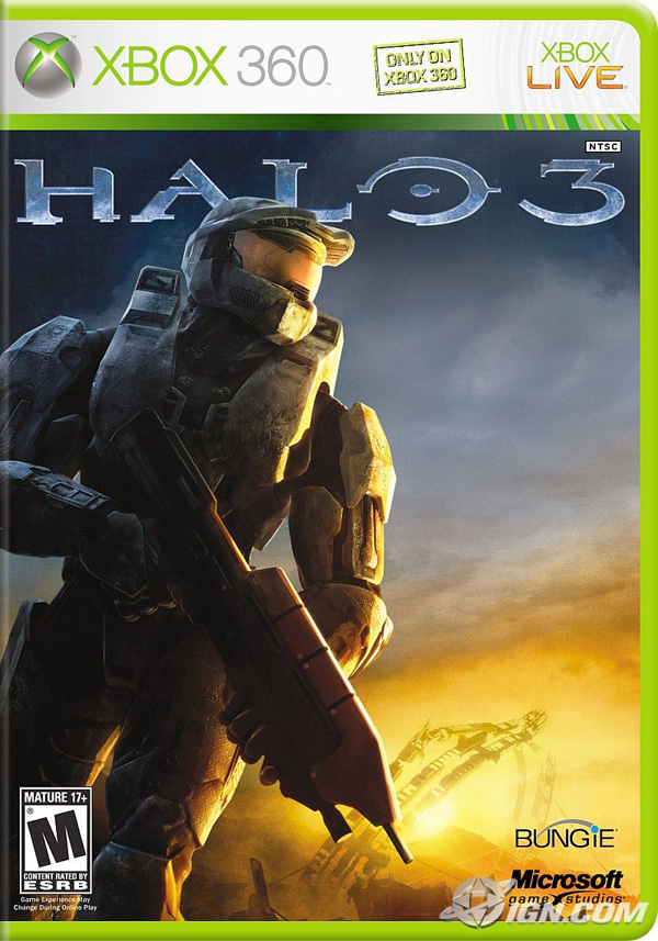
The Halo cover stands out from other first-person shooters with a lush green color scheme. This ties in perfectly with the lush green of Master Chief's combat suit. The Master Chief character has since become a gaming icon and is the center-piece of the covers for the three FPS games in the Halo franchise:
Halo 1

Halo 2
Halo 3
12. DOOM
The DOOM franchise is remarkable for the way the games have, cover-art wise, stayed true to the original. The retro-horror logo and flame engulfed color scheme features right through to 2004's Doom 3. By the time of the game's released the DOOM games were widely-recognized pioneers in the FPS genre and the cover art for DOOM 3 was clever to remind us of this.
DOOM for DOS

DOOM II: Hell on Earth

DOOM 3

11. Super Mario Galaxy
The slick and vibrant graphics of this cover are true to the 'galaxy' setting while also updating Super Mario for a new console and a new era in gaming.

10. Tomb Raider
Every Tomb Raider game, from 1996 to 2008, has featured Lara Croft on the cover. The iconic Lara Croft image has always featured the protagonist in shorts, a singlet, gloves, and wielding two pistols -- so recognizable that the designers behind 2008's 'Tomb Raider: Legend' were confident you'd be able to recognize Lara even with her face obscured. The only deviation? 2000s 'Tomb Raider: Chronicles', where Lara is wearing some kind of freaky black body-suit. Nine years on that cover sticks out like a sore thumb, but the others have helped keep the iconic Lara image alive.
Tomb Raider (1996)

Tomb Raider: Legend (2008)

9. Final Fantasy X
Final Fantasy is one of the most successful game franchises in history. Its covers hinge around a Final Fantasy logo backed by a chromatic illustration of key themes/characters from the game. The logo is simple, yet the chromatic element provides enough interest for the game cover to feature nothing else but a white background. While there are many variations on this theme, the Final Fantasy X cover demonstrates the power of this simple logo to its best effect.

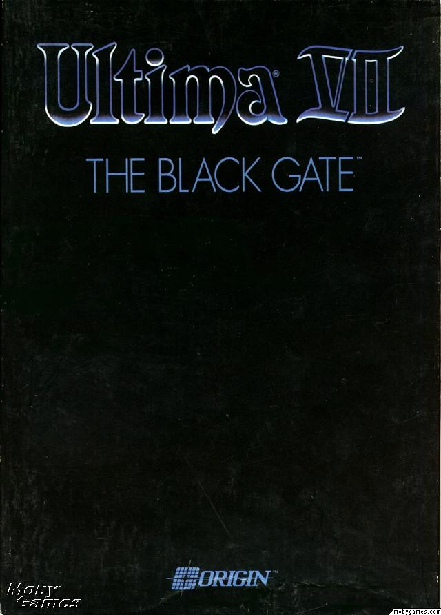
8. Ultima VII: The Black Gate
Once you've reached the 7th game in a franchise, people know what 'Ultima' means. That's why when your game is called 'The Black Gate', you can afford to have a black cover with nothing but your logo on it. This brilliantly under-stated design allowed the Ultima brand to speak for itself: a clear statement of self-confidence. The game is widely regarded to be the best in the Ultima franchise and one of the best RPGs of all time.
7. Mortal Kombat
The encircled dragon logo has featured on the cover of every single Mortal Kombat franchise game ever released. It's a brilliant icon that captures the spirit of the game. Of all the covers featuring this logo, the first is arguably the best: featuring the dragon logo, the game title and its distinctive red, yellow and black color scheme, the cover is an example of powerful graphic design that simplifies the subject down to its essential elements.

6. Metal Gear Solid 4: Guns of the Patriots
In a large franchise like MGS, it's essential that each game cover ties together with other installments in the series. Except for the original Metal Gear Solid for PlayStation (1998), each cover has featured key characters illustrated in manga style, emphasizing the game's Japanese roots.

5. Grim Fandango
The imagery of Grim Fandango, with its art deco style and skull-headed characters, was always going to make for a striking cover. The game's warm colors, mysterious characters and old-school intrigues are brilliantly portrayed in this movie-poster style game cover.

4. The Legend of Zelda: A Link to the Past
The sword, shield and red 'ZELDA' logo have become pop-culture icons. In the limited size environment of an SNES game cover, it's best to stick to what matters. That's what the designers have done here. Even the background color choice -- gold --helps to communicate that the game is a fantasy journey.

3. Super Mario Bros.
The first in a franchise of dozens, this cover marks the beginning of the iconic 'Super Mario' image. While Mario has been depicted in many different ways since this game's release in 1985, Mario in all his pixelated glory has remained the most recognizable.

2. Half-Life 2: The Orange Box
The Orange Box cover design doesn't feature complex Photoshop techniques and over-complicated imagery, and that's what makes it great. It stands out on game store shelves and in your own collection due to the bright 'safety' orange of the plastic and cover and iconic imagery representing the content in the package: Gordan Freeman's face representing Half Life 2, the portal symbol, and one of the distinctly recognizable characters from Team Fortress. The unique branding has also allowed Valve to tie this in with Half-Life 2's web presence at orange.half-life2.com.

1. Grand Theft Auto IV
The legendary Grand Theft Auto games utilize a design theme that is recognizable from across the room. Covers feature split section artwork capturing the characters and scenes you'll find inside the game, all illustrated in a distinct style by Ian McQue, lead concept artist at Rockstar North. The GTA logo with its iconic type-face has been consistent since Grand Theft Auto III. What's special about the cover design is that it focuses on what makes the Grand Theft Auto games great: the characters.

40. Diablo II
While many games use a Hellish black and red color scheme in their cover art, no game has ever done this quite so well as Diablo II. The embossing used to accentuate the logo and the outlines around Mephisto's facial (skull-ial?) features are a nice tactile addition, while the wizard style hood Mephisto is wearing and strange runes remind players that this is a dark fantasy game, not just pure horror.

39. Crysis
The washed-out blue/gray of color scheme draws attention to the points of red light on the power suit, as well as to the EA logo, which is cleverly modified for the cover. While the power-suit is distinctly sci-fi, the tropical mountain and palm-trees hint that the setting may not be quite what you expect! The colors are also extremely cold, consistent with the freezing temperatures that you encounter periodically throughout the game. This creates an interesting contrast with the tropical setting subtly depicted on the cover.

38. Resistance: Fall of Man
This game's cover art uses the classic image of a helmeted skull in a battlefield with a new and striking twist. As you can see, the skull is thoroughly mutated, suggesting that the world is no-longer as we know it. The intricate detail in the logo design is also worth mentioning.

37. Killzone 2
While the 'helmeted figure glaring out at viewer' is a game art cover standard, Killzone 2 does this really well. The burning points of light in the character's eyes are extremely intense and provide a central point of focus. This edges it just ahead of its rival in this cover style, Fallout 3.
Killzone 2

Fallout 3

36. Baldur's Gate II: Shadows of Amn
The Baldur's Gate game covers were all designed to look like mystical, leather-bound books with a central emblem. This demonstrated the game's high fantasy setting while also unifying the cover art across each game and expansion pack.

35. Sim City 2000
An idyllic, colorful city. An absurd space-ship bordered with pink neon. An art deco logo. The cover is that special brand of Maxis-weird that you won't find anywhere else. The signatures of Will Wright and Fred Haslam (the game's designers) are a really nice touch and emphasize the craftsmanship behind the game.

34. F.E.A.R.
This cover art throws a spanner into the workings of the traditional 'shooter' cover. While it features action and armored, armed figures, the whole scene is overseen by the ghostly--and in this rendering, larger than life--Alma. As this image is really the iconic image from the game, the graphic designers have cleverly made this the centerpiece of the cover.

33. Star Wars: The Force Unleashed
The central theme throughout this cover design is the powerful Force-wave being unleashed by the central figure. It shapes the entire composition. The designer's have also cleverly warped the game's logo, as if it too is being affected by this explosion of power. While the game may not be an instant classic, the cover certainly is.

32. Age of Empires II: Age of Kings
This cover packs plenty of detail without cluttering the composition. By rendering the background illustrations in shades of the same color, focus is not drawn away from the three central figures and the game's logo.

31. Gears of War
While 'armored guy with weapon' is a front-cover cliche, this one stands apart from the pack by virtue of its attention to detail. The characters and even the background setting are meticulously rendered, creating a rich overall image.

30. Jade Empire
The game's regal logo and mythic concept artwork results in a cover that cleverly represents this oriental fantasy game. The cover offers a whirlwind introduction to a genre with few precedents.

29. Sins of a Solar Empire
The cover's brilliant blue at the bottom contrasted with solar red at the top focuses attention on the game's striking logo.

28. Elder Scrolls IV: Oblivion
While the cover art isn't flashy, it's remarkable for its clever use of texture. The design appears to be rendered on an ancient, fraying canvas. The game's cover entices you to touch it.

27. Deus Ex
This cover is note-worthy because of the way it uses color and representative imagery to perfectly capture the mood of the game.

26. Alone in the Dark
While the Alone in the Dark games have been re-invented since the first debuted in 1992, the game's covers have retained a remarkable sense of unity, paying homage to the original classic cover design with a modern horror update.
Alone in the Dark (1992)

Alone in the Dark (2001)

25. Lego Batman
The 'LEGO' games as a franchise have featured covers that blend established pop culture figures (Indiana Jones, Star Wars characters) with Lego imagery, adding a clever new twist to images we're all familiar with.

24. Mass Effect
A classic space opera cover featuring the BioWare designed Commander Shepherd character. Though you could customize your character's face with a variety of facial modeling features, BioWare's default model was so realistic that it quickly became a representative for a new era in human realism in video games.

23. Little Big Planet
This cover fuses gorgeous hand-made elements with controlled explosions of color.

22. Contra
Another retro title, Contra is renowned for being one of the most difficult games in history. Its cover is remarkable for its clarity of message: "This is a game about being a bad-ass and shooting alien scum!"

21. World of WarCraft
The visual style of this virtual world is part of its branding, and this is portrayed faithfully in the cover art. The gold, circular frame around the central image is carried through the cover art for the expansion packs also, creating unity between each World of WarCraft product.

20. System Shock 2
The image of SHODAN, the game's insane AI antagonist, is one that has become an icon in sci-fi/horror video gaming history.

19. Far Cry
The first installment in the Far Cry series was, at the time, a pioneer in the development of realistic natural environments in games. While other shooters focused on dark corridoors and gloomy, linear areas, Far Cry rendered a lush tropical environment. The cover conveys this perfectly and would have stood out brilliantly against the other dark and clichéd shooters on the shelves.

18. The Sims 2
'The Sims' franchise of games are among the best-selling in history. Here, the graphic designs have cleverly incorporated the 'mood diamond' (an essential part of the games' user interface) into its logo. The figures chosen for the cover cleverly represent the key aspects of gameplay in The Sims 2.

17. BioShock
The BioShock logo is certainly one of the coolest in modern gaming, and the cover art ticks all the boxes when it comes to featuring iconic images from the game: the Little Sister, the Big Daddy, and the water that spills out everywhere. BioShock is all about mood, and this cover captures it perfectly.

16. Half Life 2
Every Half-Life fan recognizes the distinctive face of Gordon Freeman, the game's silent hero. Though the game features many stunning visuals that could have been used to represent it on the cover, the designers cleverly simplified down to Half-Life's most distinctive image.

15. StarCraft
Alien eyes stare out at you from the cover of the original StarCraft. The expansion packs unified the visuals by featuring different exotic faces on their respective covers.

14. Pokemon Blue
The Pokemon games for Game Boy were cleverly designed. Call the game a color, feature a Pokemon colored to match the game's title, do the same with the background. It seems simplistic, but for the legions of kids who wanted these games it meant that you could spot who had what Pokemon cartridge from across the playground. The end result were arguably the most memorable Game Boy game covers ever created.

13. Halo
The Halo cover stands out from other first-person shooters with a lush green color scheme. This ties in perfectly with the lush green of Master Chief's combat suit. The Master Chief character has since become a gaming icon and is the center-piece of the covers for the three FPS games in the Halo franchise:
Halo 1

Halo 2

Halo 3

12. DOOM
The DOOM franchise is remarkable for the way the games have, cover-art wise, stayed true to the original. The retro-horror logo and flame engulfed color scheme features right through to 2004's Doom 3. By the time of the game's released the DOOM games were widely-recognized pioneers in the FPS genre and the cover art for DOOM 3 was clever to remind us of this.
DOOM for DOS

DOOM II: Hell on Earth

DOOM 3

11. Super Mario Galaxy
The slick and vibrant graphics of this cover are true to the 'galaxy' setting while also updating Super Mario for a new console and a new era in gaming.

10. Tomb Raider
Every Tomb Raider game, from 1996 to 2008, has featured Lara Croft on the cover. The iconic Lara Croft image has always featured the protagonist in shorts, a singlet, gloves, and wielding two pistols -- so recognizable that the designers behind 2008's 'Tomb Raider: Legend' were confident you'd be able to recognize Lara even with her face obscured. The only deviation? 2000s 'Tomb Raider: Chronicles', where Lara is wearing some kind of freaky black body-suit. Nine years on that cover sticks out like a sore thumb, but the others have helped keep the iconic Lara image alive.
Tomb Raider (1996)

Tomb Raider: Legend (2008)

9. Final Fantasy X
Final Fantasy is one of the most successful game franchises in history. Its covers hinge around a Final Fantasy logo backed by a chromatic illustration of key themes/characters from the game. The logo is simple, yet the chromatic element provides enough interest for the game cover to feature nothing else but a white background. While there are many variations on this theme, the Final Fantasy X cover demonstrates the power of this simple logo to its best effect.

8. Ultima VII: The Black Gate
Once you've reached the 7th game in a franchise, people know what 'Ultima' means. That's why when your game is called 'The Black Gate', you can afford to have a black cover with nothing but your logo on it. This brilliantly under-stated design allowed the Ultima brand to speak for itself: a clear statement of self-confidence. The game is widely regarded to be the best in the Ultima franchise and one of the best RPGs of all time.

7. Mortal Kombat
The encircled dragon logo has featured on the cover of every single Mortal Kombat franchise game ever released. It's a brilliant icon that captures the spirit of the game. Of all the covers featuring this logo, the first is arguably the best: featuring the dragon logo, the game title and its distinctive red, yellow and black color scheme, the cover is an example of powerful graphic design that simplifies the subject down to its essential elements.

6. Metal Gear Solid 4: Guns of the Patriots
In a large franchise like MGS, it's essential that each game cover ties together with other installments in the series. Except for the original Metal Gear Solid for PlayStation (1998), each cover has featured key characters illustrated in manga style, emphasizing the game's Japanese roots.

5. Grim Fandango
The imagery of Grim Fandango, with its art deco style and skull-headed characters, was always going to make for a striking cover. The game's warm colors, mysterious characters and old-school intrigues are brilliantly portrayed in this movie-poster style game cover.

4. The Legend of Zelda: A Link to the Past
The sword, shield and red 'ZELDA' logo have become pop-culture icons. In the limited size environment of an SNES game cover, it's best to stick to what matters. That's what the designers have done here. Even the background color choice -- gold --helps to communicate that the game is a fantasy journey.

3. Super Mario Bros.
The first in a franchise of dozens, this cover marks the beginning of the iconic 'Super Mario' image. While Mario has been depicted in many different ways since this game's release in 1985, Mario in all his pixelated glory has remained the most recognizable.

2. Half-Life 2: The Orange Box
The Orange Box cover design doesn't feature complex Photoshop techniques and over-complicated imagery, and that's what makes it great. It stands out on game store shelves and in your own collection due to the bright 'safety' orange of the plastic and cover and iconic imagery representing the content in the package: Gordan Freeman's face representing Half Life 2, the portal symbol, and one of the distinctly recognizable characters from Team Fortress. The unique branding has also allowed Valve to tie this in with Half-Life 2's web presence at orange.half-life2.com.

1. Grand Theft Auto IV
The legendary Grand Theft Auto games utilize a design theme that is recognizable from across the room. Covers feature split section artwork capturing the characters and scenes you'll find inside the game, all illustrated in a distinct style by Ian McQue, lead concept artist at Rockstar North. The GTA logo with its iconic type-face has been consistent since Grand Theft Auto III. What's special about the cover design is that it focuses on what makes the Grand Theft Auto games great: the characters.

La mejor caratula de la historia es esta:

A mi gusto la mejor es esta.
Última edición:
- Unido
- agosto 16, 2007
- Mensajes
- 1,333
- Karma
- 373
No sé mucho de diseño, lo admito, pero poner cómo la segunda mejor de 40, la del Orange Box, me parece algo cuestionable.
Aunque claro, también reconozco que no estoy de acuerdo con ninguna, en ningún orden de los que hay en la lista. Anda que no hay portadas...
Aunque claro, también reconozco que no estoy de acuerdo con ninguna, en ningún orden de los que hay en la lista. Anda que no hay portadas...
Orange Box en segundo lugar? jajajajaj pero si es la caratula mas fea que a parido el ser humano........
Con la primera caratula si que estoy de acuerdo, con las demas no, muchas las subiria a arriba, otras ni las pondria, y ademas añadiria algunas..........
salud
Con la primera caratula si que estoy de acuerdo, con las demas no, muchas las subiria a arriba, otras ni las pondria, y ademas añadiria algunas..........
salud
La verdad es que la lista parece estar hecha un poco a voleo xDDD
Algunas están muy bien, pero otras.....pfff, y como dice Wolfenprey, poner la segunda de la lista la de Orange Box es bastante cuestionable, para mi concretamente esa es una de las carátulas más feas que he visto últimamente, pero vamos, que tampoco soy una eminencia en el tema.
Se me ocurren así a bote pronto varias decenas de carátulas mejores, para mi gusto claro.
Saludos!
BigInJapan
Lord
Particularmente las de MGS4 y las de Killzone me parecen bastante penosillas.
Y colocar de Orange Box en el segundo lugar dice mucho de como han hecho la lista, al "tun-tun".
Me quedo con estas:


Y colocar de Orange Box en el segundo lugar dice mucho de como han hecho la lista, al "tun-tun".
Me quedo con estas:


LOL decidme que tiene de currado la 8 por favor? XD
Por dios, si yo no he visto caratula más mala que la de "The Orange Box", ¿que hace en el puesto 2?
es que para poner esa, casi mejor una que no tanto por buena sino mas bien por mitica, deberia estar ahi.Por dios, si yo no he visto caratula más mala que la de "The Orange Box", ¿que hace en el puesto 2?
me refiero a aquella en la que un Raul Gonzalez, que por entonces aun era futbolista, no como ahora... remataba una volea caida del cielo vestido con el traje de la seleccion Española, dejandonos flipados a todos pues era la primera vez que veiamos una caratula tan localizada,y encima las letras azules estilizadas que nos anunciaban FIFA 98 "rumbo al mundial"... y dentro nos esperaba uno de los mejore sjuegos de futbol jamas paridos, con realismo de movimientos, comentarios localizados por primera vez (que aun perduran sus comentarsitas) y miles de equipos y modos de juegos incluyendo futbol sala, y con aquella no menos mitica banda sonora que aun cuando suena uno dice "anda, la de FIFA98". te gusten o no los juegos de futbol, y aunque haya caratulas mejores, nadie puede negar que esa, es una caratula que quedara para el recuerdo y que es una de las mas miticas. pero claro, como solo fue para España, pues no aparece en el ranking.
¿alquien se ha olvidado de esto?

ya digo, no tanto por buen como por mitica y recordada....
PD: otra que es GENIAL es la de Street fighter 4, se merecia estar ahi, porque es espectacular y con un diseño increible.
la de SFIV tendria que estar en la lista xD
la de kz2 esta muy padre.
- Unido
- febrero 7, 2009
- Mensajes
- 187
- Karma
- 11
seguro la lista esta echa por alguien que no sabe mucho de arte :buf:La verdad es que la lista parece estar hecha un poco a voleo xDDD
Algunas están muy bien, pero otras.....pfff, y como dice Wolfenprey, poner la segunda de la lista la de Orange Box es bastante cuestionable, para mi concretamente esa es una de las carátulas más feas que he visto últimamente, pero vamos, que tampoco soy una eminencia en el tema.
Se me ocurren así a bote pronto varias decenas de carátulas mejores, para mi gusto claro.
Saludos!
la de MGS4 no me gusto prefiero una de estas:Particularmente las de MGS4 y las de Killzone me parecen bastante penosillas.
Y colocar de Orange Box en el segundo lugar dice mucho de como han hecho la lista, al "tun-tun".
Me quedo con estas:


esta es la que mas me gusta:

la de KZ2 no la veo muy fea pero tampoco muy linda :buf: